
JeeMon lets you zoom in (“drill down”) on the electricity / gas / water consumption data. Here’s how:
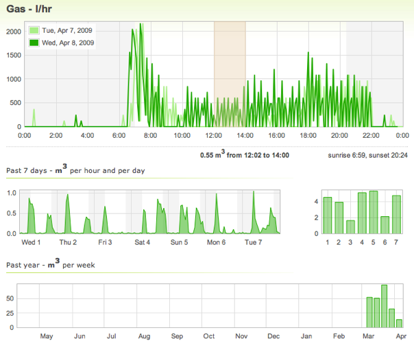
That’s 4 graphs: 1-day details with 5-minute resolution, 2 weekly summaries, and an entire year.
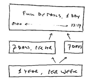
The weekly graphs only differ in the level of detail: on the left is the daily change each hour, whereas the graph on the right shows daily totals.
Clicking on a day in either of the weekly graphs causes the daily graph to display that day. And a click on any week in the year overview switches both weekly graphs to that week.
With two mouse clicks on this page you can display the details of any day in the past year. To easily go back to the initial display, a “Go to Today” button appears once a different graph has been selected (same as a refresh).
Note also that selecting a time range in the daily graph calculates the total consumption in that period, and hovering over a bar in the bar graphs displays the exact value as a tooltip.
No other zooming or panning is available, just these fixed choices. Simple and effective, IMO.