
I’ve installed a preliminary JeeNode pulse upstairs, with a few 1-wire temperature sensors to track hot-water and central heating a bit. Here’s the real-time read-out, coming from the JeeHub:
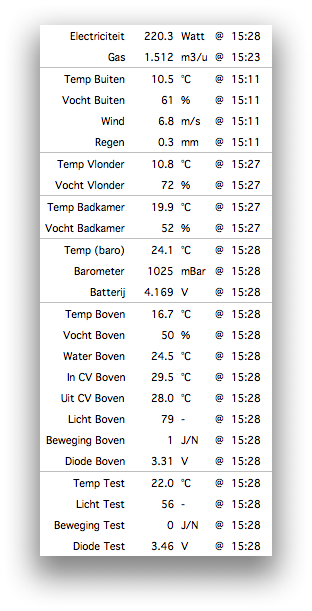
These readings are coming from the following sources, mostly via wireless:
- Electricity / gas meter, from a prototype JeeNode.
- Weather data from 1 KS300 + 2 S300 commercial sensors.
- Barometer and battery check, inside the JeeHub.
- Room data and central heating temperatures, from a JeeNode Pulse
- Some test values, from a second JeeNode Pulse on my desk.
But this display clearly won’t scale visually. Besides, it’s just a big pile of numbers. I really need to figure out a way to present this information nicely!
It’s fun to watch, seeing values update in real time…
tklib Plotchart ? Gallery: http://wiki.tcl.tk/18167
web server … http://wiki.tcl.tk/22576 (tclgd) … I should ask Arjen about making it a backend for the chart code.
Interesting.