
As promised yesterday, here is some information on how you can get a page layouts off the ground real quick with the Zurb Foundation 4 CSS framework. If you’re more into Twitter Bootstrap, see this excellent comparison and overview. They are very similar.
It took a little while to sink in, until I read this article about how it’s supposed to be used, and skimmed through a 10-part series on webdesign tuts+. Then the coin dropped:
- you create rows of content, using a
divwith classrow - each row has 12 columns to put stuff in
- you put the sections of your page content in divs with class
large-6andcolumns - each section goes next to the preceding one, so 6 and 6 puts the split in the middle
- any number from 1 to 12 goes, as long as you use at most 12 columns per row
So far so good, and pretty trivial. But here’s where it gets interesting:
- each column can have more rows, and each row again offers 12 columns to lay out
- for mobile use, you can add
small-Nclasses as well, with other column allocations
I haven’t done much with this yet, but this page was trivial to generate:
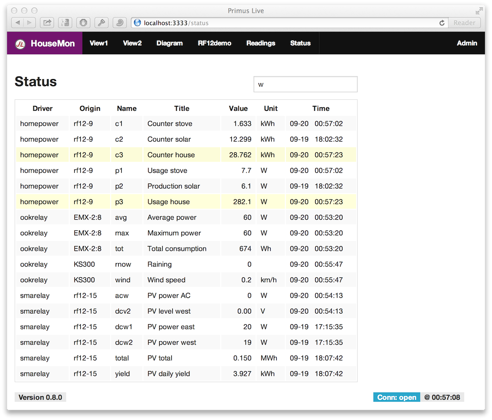
The complete definition of that inner layout is in app/status/view.jade:
.row
  .large-9.columns
    .row
      .large-8.columns
        h3 Status
      .large-4.columns
        h3
        input(type='text',ng-model='statusQuery',placeholder='Search...')
    .row
      .large-12.columns
        table(width='100%')
          tr
            th Driver
            th Origin
            th Name
            th Title
            th Value
            th Unit
            th Time
          tr(ng-repeat='row in status | filter:statusQuery | orderBy:"key"')
            td {{row.type}}
            td {{row.tag}}
            td {{row.name}}
            td {{row.title}}
            td(align='right') {{row.value}}
            td {{row.unit}}
            td {{row.time | date:"MM-dd   HH:mm:ss"}}
In prose:
- the information shown uses the first 9 columns, (the remaining 3 are unused)
- in those 9 columns, we have a header row and then the actual data table as row
- the header is a
h1header on the left and aninputon the right, split as 2:1 - the table takes the full width (of those 9 columns in which it resides)
- the rest is standard HTML in Jade notation, and an Angular
ng-repeatloop - there’s also live row filtering in there, using some Angular conventions
- the alternating row backgrounds and general table style are Foundation’s defaults
Actually, I left out one thing: the entries automatically get highlighted whenever the time stamp changes. This animation is a nice way to draw attention to updates – stay tuned.
when I click on the link for “Zurb Foundation 4” or “this article” then nothing happens
A lot can be said about CSS grids, but me personally don’t like them at all. It makes it very hard to separate content from presentation. It’s good for prototyping, but a proper semantic web is the way to go :)