
Here’s a real-time graph of data collected by JeeMon:
And a snapshot, in case the above real-time graph isn’t working right now:
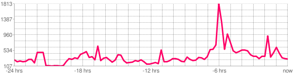
It’s generated via a new site called pachube – I’ve extended JeeMon to feed that site through simple REST-style HTTP requests. Since the graph only has 15-minute resolution, that’s how often it gets updated.
Here’s another real-time feed, showing our gas consumption in l/hr:
Pachube is still in beta. I’ve only just started looking into it. You can define any number of feeds, each having any number of data values. Not sure how it deals with missing values, nor what to do about data which is collected at different rates. The graphs are somewhat configurable, as you can see – this will no doubt still evolve further.
Pachube can poll a server you designate (“automatic” mode), or you can feed it new data at your own pace (“manual” mode), as is being done here. The advantage of the latter is that it gets through firewalls and avoids the security issues of running a public server.
It’s an interesting approach, apparently pachube aims to become some sort of free exchange for producers and consumers of location-specific real-time data.
I’ll leave this setup running for now, but don’t be surprised if this post stops showing an up-to-date graph, since I might stop this feed one day.